
 Web design fads come and go faster than political posts in Facebook, so it’s important to weigh their potential against their impact on your site. Sometimes these elements benefit the user experience and become common user interface patterns. But often these experiences fail to deliver any tangible results.
These two “fads” have proven their worth and become mainstays in today’s web design.
Responsive design
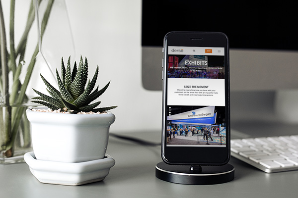
Responsive design is no longer just a fad, it is best practice. Although Google has been using the mobile version of a website to rank pages since 2016, the company announced in March that mobile-first indexing will be used for all sites starting in September 2020. The ranking of your web pages will now be determined by the mobile version of your site, even if most of your site visitors use desktops. Plus, with ever-rising mobile traffic and the cross-pollination of site traffic from social media, it is imperative to deliver a site tailored to the user’s specific device. Responsive sites use percentage-based widths and responsive images to adjust layouts as they scale down to mobile devices. This fluidity, along with the ability to turn off elements to reduce clutter, leads to increased site performance.
The bottom line is that if your site isn’t responsive, it will hurt your bottom line!
Of course we’re always looking for design inspiration and working to understand how current technology is impacting your website visitors’ expectations. By integrating these two best practices into the creative ideas for improving user experience on your site, your website can support your other marketing channels and help you achieve your business goals.
Hero images (not the Marvel or DC kind)
We’ve all seen multi-image sliders or carousels at the top of website home pages. Although they’re very common, studies have shown that the use of multiple images can lead to mixed messaging and confusion from a marketing standpoint. In addition, image sliders increase load time because multiple images and scripts need to load in order to run these elements. Instead, we recommend pairing a hero image with elements that move a user down the page (users do scroll, and the lingering myth to the contrary has been debunked). This eliminates the need for confusing carousels and reduces load time.
By reducing the clutter on a page and presenting a singular image tied to your marketing message, you reduce the potential for information overload and allow a user to focus and settle into your site. If you want something more visually exciting, using subtle animation or video elements can enhance the visibility of the area, furthering the potential of discovery.